以前只知道 border-radius 有一个圆角半径,今天在做一个半圆的时候突然发现,它还有 x 轴和 y 轴属性。
先来看一下 MDN 中 border-radius 说明:
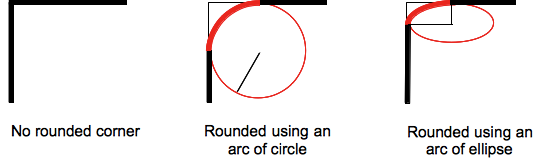
CSS 属性 border-radius 允许你设置元素的外边框圆角。当使用一个半径时确定一个圆形,当使用两个半径时确定一个椭圆。这个(椭)圆与边框的交集形成圆角效果。
该属性是一个 简写属性,是为了将这四个属性 border-top-left-radius、border-top-right-radius、border-bottom-right-radius,和 border-bottom-left-radius 简写为一个属性。
也就是说,每个圆角都有 圆角半径、 水平半长轴 和 垂直半长轴 属性值:
border-radius: 1em;

/* 等价于: */
border-top-left-radius: 1em;
border-top-right-radius: 1em;
border-bottom-right-radius: 1em;
border-bottom-left-radius: 1em;border-radius: 1em/5em;
/* 等价于: */
border-top-left-radius: 1em 5em;
border-top-right-radius: 1em 5em;
border-bottom-right-radius: 1em 5em;
border-bottom-left-radius: 1em 5em;还有一个复杂一些的 demo
border-radius: 4px 3px 6px / 2px 4px;

/* 等价于: */
border-top-left-radius: 4px 2px;
border-top-right-radius: 3px 4px;
border-bottom-right-radius: 6px 2px;
border-bottom-left-radius: 3px 4px;
按照 MDN 上示例的拓展
半圆
.semicircle {
  width: 100px;
  height: 50px;
  background: red;
  border-radius: 50% 50% 0 0 / 100% 100% 0 0;
}
气泡
.bubble {
  width: 120px;
  height: 120px;
  background: red;
  border-radius: 60px 60px 0 60px;
}
鸡蛋
.egg {
  width: 120px;
  height: 160px;
  background: red;
  border-radius: 60px 60px 60px 60px/100px 100px 60px 60px;
}
DEMO 在 CodePen.io
参考:
MDN : https://developer.mozilla.org/zh-CN/docs/Web/CSS/border-radius